

17966
Subscription offers
Subscription - Access to Excel, Power BI and Ms project tutorials and models
-
J8/ Model — Calculation and monitoring of OEE Excel 2025 - Industry 4.0 - 1k Users
Regular price From €159,00Regular price€279,00Sale price From €159,00Sale -
J9/ Budget and Deliverables Tracking Template for Business
Regular price From €59,00Regular price€249,00Sale price From €59,00Sale -
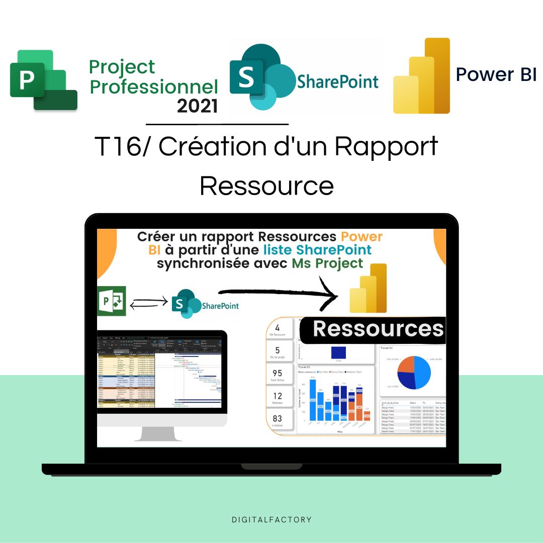
J28/ Power Bi Project Management Template to download
Regular price From €0,00Regular price -
J27/ MS Project Gantt Planning Template to download
Regular price From €69,00Regular price -
J10/ Project Management Excel Model for project managers
Regular price From €49,00Regular price€219,00Sale price From €49,00Sale -
J30/ Power BI Model - Risk Analysis (Amdec)
Regular price From €0,00Regular price -
J7/ Model — Example FMEA Excel Process - Dashboard - RPN Monitoring
Regular price From €59,00Regular price -
C1/ ebook: White Paper - From vision to action, the future of industry
Regular price €39,00Regular price -
A2/ Advanced OEE Excel Template - Powerful Manufacturing Dashboard
Regular price From €99,00Regular price€99,00Sale price From €99,00 -
A1/ Template - Budget and project deliverables tracking - Google Sheet
Regular price From €29,00Regular price€59,00Sale price From €29,00Sale -
A9/ Model - Project Risk Analysis - Google Sheet/Excel
Regular price €39,00Regular price€149,00Sale price €39,00Sale -
A3/ Model - Process FMEA - Google Sheet/Excel - Pro
Regular price From €29,00Regular price€59,00Sale price From €29,00Sale -
A5/ Model - Dasboard KPI Planning MS Project - Excel - Google Sheet
Regular price From €49,00Regular price -
A5/ Excel FMEA Template - Google Sheet/Excel - Basic
Regular price €0,00Regular price -
C2/ Model — OEE Dashboard - Production Tracking - Excel Template
Regular price From €49,00Regular price€99,00Sale price From €49,00Sale -
A6/ Template — Machine risk analysis — Google Sheet/Excel
Regular price €499,00Regular price -
A8/ Model — Maintenance instructions - Example User Manual - Doc
Regular price From €39,00Regular price -
A4/ Model — Suppliers assessment — Google Sheet/Excel
Regular price From €9,00Regular price€29,00Sale price From €9,00Sale -
J6/ Model — Free Excel Production Monitoring File: Example of OEE Calculation
Regular price €0,00Regular price -
J11/ PDF — TRS - Definition, calculation, benefits and implementation
Regular price €0,00Regular price -
J12/ PDF — Industry 5.0: Definition, technology, advantages and challenges
Regular price €0,00Regular price -
J13/ Maintenance Management Excel Model (CMMS)
Regular price From €99,00Regular price -
Power BI Dashboard OEE — Overall Equipment Effectiveness Tracking
Regular price From €0,00Regular price -
J14/ 5S Excel Model: Checklist, Audit and Control for Industry
Regular price €0,00Regular price -
J15/ Advanced DMAIC Model for your Lean Six Sigma Projects - Free Download
Regular price €0,00Regular price


Any questions?

Make an appointment with an expert via Google Calendar Appointment
Or
Write to Us
Contact form
blog posts
View all-

The Future of Work: Key Skills for the AI Era i...
The AI era is radically redefining professional skills. Discover the essential skills for working with AI agents, copilots, and Digital Factory tools in 2026.
The Future of Work: Key Skills for the AI Era i...
The AI era is radically redefining professional skills. Discover the essential skills for working with AI agents, copilots, and Digital Factory tools in 2026.
-

Industrial Dashboards: The Complete Guide to Ma...
Industrial dashboards turn factory data into quick decisions. Learn how to choose, build, and leverage your dashboards to maximize OEE and productivity in 2026.
Industrial Dashboards: The Complete Guide to Ma...
Industrial dashboards turn factory data into quick decisions. Learn how to choose, build, and leverage your dashboards to maximize OEE and productivity in 2026.

