

HSE Dashboard: Managing Safety and Environment with Excel in 2026
The HSE dashboard (Health, Safety, Environment) is an essential tool for managing the safety and environmental performance of any industrial or service organization. In 2026, with tightening regulations (CSRD directive, revised ISO 45001, European green taxonomy), having structured HSE reporting is no longer an option but a strategic obligation. This article guides you step-by-step on how to build an effective HSE dashboard in Excel, identify the right KPIs, and turn your safety data into concrete decisions. Whether you are an HSE manager, plant director, or site supervisor, you will find here the templates, indicators, and methods to move from reactive monitoring to proactive management.
What is an HSE dashboard and why is it essential?
An HSE dashboard is a visual reporting tool that centralizes all indicators related to health, occupational safety, and environmental performance of a company. It allows decision-makers to track in real-time — or at regular intervals — the evolution of workplace accidents, near misses, polluting emissions, regulatory compliance, and ongoing corrective actions.
Unlike a simple incident log, the HSE dashboard offers a synthetic and actionable vision. It transforms raw data (number of accidents, frequency rate, energy consumption) into graphs, gauges, and visual alerts that facilitate rapid decision-making. According to an INRS study published in 2025, companies with a structured HSE dashboard reduce their accident frequency rate by an average of 23% over three years compared to those that rely on informal monitoring.
In 2026, three factors make this tool even more critical:
- Increasing regulatory pressure — The CSRD directive requires detailed extra-financial reporting including HSE data for all companies with more than 250 employees.
- Stakeholder demands — Investors, customers, and clients require tangible proof of safety and environmental performance.
- Digital transformation — The integration of IoT sensors and real-time data requires a consolidation tool capable of absorbing increasing volumes of data.
The HSE dashboard therefore forms the basis of fact-based management applied to safety and the environment. It is the interface between field data and business strategy.

Key KPIs for an HSE dashboard
The choice of HSE indicators directly determines the usefulness of your dashboard. A reporting system overloaded with unusable data is as ineffective as an empty one. The challenge is to select KPIs that are simultaneously relevant, measurable, and actionable. We generally distinguish two main families of indicators: reactive (lagging indicators), which measure what has already happened, and proactive (leading indicators), which anticipate future risks.
Reactive indicators are the most common because they are based on factual data:
- Frequency Rate (FR) — Number of accidents with lost time × 1,000,000 / number of hours worked. This is the benchmark indicator in France and Europe.
- Severity Rate (SR) — Number of lost days × 1,000 / number of hours worked. It complements the FR by measuring the severity of accidents.
- Number of reported near misses — A hybrid indicator, both reactive (it measures past events) and proactive (a high volume of reports indicates a mature safety culture).
- Total cost of incidents — Direct costs (medical care, compensation) and indirect costs (replacement, loss of production).
Proactive indicators, more difficult to collect, are nevertheless the most powerful for preventing accidents:
- Safety audit completion rate — Percentage of planned audits actually carried out.
- Number of Safety Behavioral Visits (SBV) — Measures managerial engagement in the field.
- Corrective action closure rate — Percentage of actions resulting from incident analyses closed within deadlines.
- Safety training hours per employee — Indicator of HSE skill development.
For the environmental dimension, key KPIs include energy consumption per unit produced, CO₂ emissions (scopes 1 and 2), waste recovery rate, and water consumption. These indicators are now required by the quality and compliance approach within the framework of CSRD reporting.
- Average accident reduction with a structured HSE dashboard: 23%
- French companies compliant with CSRD in 2026: 41%
- Average ROI of a digitized HSE program: 4.2x
- Time saved on HSE reporting with structured Excel: 60%
Building an HSE dashboard in Excel: step-by-step methodology
In 2026, Excel remains the most accessible and widespread tool for building an HSE dashboard, particularly in SMEs and mid-sized industrial companies. Here is a five-step methodology for creating a functional and professional HSE reporting system.
Step 1: Define the scope and objectives
Before opening Excel, clarify the scope of your dashboard. Does it cover a single site or multiple? Does it only include safety or also environment and health? Who are the recipients (executive committee, site managers, health and safety committee)? This step determines the level of detail and the update frequency. A dashboard intended for the executive committee will be synthetic (maximum 5-8 KPIs), while an operational tool for the field HSE manager may contain 15-20 detailed indicators.
Step 2: Structure the Excel workbook
A well-designed HSE workbook generally includes four types of tabs:
- "Raw Data" tab — Entry of incidents, audits, training, consumption. Use structured tables (Ctrl+T) to facilitate formulas and pivot tables.
- "Calculations" tab — Formulas for calculating KPIs (FR, SR, closure rate, etc.). Always separate raw data from calculations.
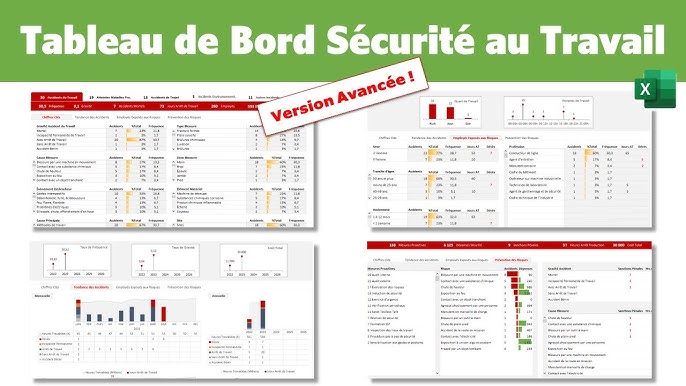
- "Dashboard" tab — Visualization with graphs, gauges, and conditional formatting. This is the tab you present in meetings.
- "Parameters" tab — Drop-down lists, alert thresholds, annual objectives.
Step 3: Automate calculations and alerts
Use SUMPRODUCT, COUNTIFS, and INDEX/MATCH functions to automatically calculate your KPIs from raw data. Conditional formatting is your best ally: set up traffic lights (green/orange/red) for each indicator based on the thresholds defined in the Parameters tab. To go further, modern industrial dashboards integrate VBA macros or Power Query connections to automate data import.
Step 4: Design visualizations
Prioritize clarity over aesthetics. A good HSE dashboard uses bar charts for monthly comparisons, trend lines for tracking over time, and gauges or thermometers for annual objectives. Limit yourself to 6-8 graphs per page to avoid cognitive overload.
Step 5: Deploy and animate
A dashboard is only valuable if it is used. Define an update routine (weekly or monthly), identify a data entry person, and integrate dashboard review into your steering meetings. Team training on tool usage is a key success factor often overlooked.
Comparison of HSE dashboard models: Excel vs. Power BI vs. dedicated software
The choice of tool for your HSE reporting depends on the size of your organization, the volume of data, and your budget. Here is an objective comparison of the three main options available in 2026.
Excel remains the most popular solution due to its universality and almost zero cost. It is perfectly suited for SMEs and isolated industrial sites that manage fewer than 500 HSE events per year. However, it reaches its limits when multiple sites need to consolidate their data or when the volume of incidents exceeds a thousand annually.
Power BI (or Looker Studio) offers an excellent compromise: connected to your Excel files or your ERP, it allows you to create interactive dashboards with automatic refreshing. Its cost is moderate (approximately €10/user/month for Power BI Pro) and it integrates naturally into the Microsoft ecosystem. This is the recommended solution for multi-site mid-sized companies.
Dedicated HSE software (Enablon, Quentic, BlueKanGo) offers advanced features: approval workflow, integrated document management, automated regulatory compliance. Their cost is significantly higher (€5,000 to €50,000/year depending on size), but they provide considerable added value for large groups subject to complex regulatory requirements.
| Criterion | Excel | Power BI / Looker Studio | Dedicated HSE Software |
|---|---|---|---|
| Annual Cost | €0 – €150 | €120 – €1,200 | €5,000 – €50,000 |
| Ease of use | ★★★★★ | ★★★☆☆ | ★★☆☆☆ |
| Multi-site / Consolidation | ★★☆☆☆ | ★★★★☆ | ★★★★★ |
| Reporting Automation | ★★☆☆☆ | ★★★★☆ | ★★★★★ |
| Regulatory Compliance | ★★☆☆☆ | ★★★☆☆ | ★★★★★ |
| Customization | ★★★★★ | ★★★★☆ | ★★★☆☆ |
| Ideal for | SMEs, single-site | Mid-sized companies, multi-site | Large groups, regulated industries |
HSE Excel template: standard structure and good design practices
An effective HSE dashboard Excel template relies on rigorous design principles. Here are the best practices derived from the experience of hundreds of HSE managers in industrial settings.
Principle 1: Separate data and display. Never mix raw data entry and graphs in the same tab. This separation facilitates maintenance, reduces errors, and allows adding new KPIs without disrupting the dashboard layout.
Principle 2: Use structured tables. Systematically convert your data ranges into Excel structured tables (Ctrl+T). They automatically expand when you add rows, formulas adjust, and pivot tables update with one click.
Principle 3: Standardize entry. Use drop-down lists (data validation) for categorical fields: incident type (accident, near miss, dangerous situation), severity (minor, significant, major), affected area, root cause. This eliminates free-text entry errors and ensures the reliability of analyses.
Principle 4: Integrate dynamic alert thresholds. Create a "Parameters" tab containing your annual objectives (e.g., FR < 5, action closure rate > 90%). Reference these thresholds in your conditional formatting so that the dashboard automatically turns red when an indicator exceeds the critical threshold.
Principle 5: Plan for history. Structure your data to maintain a history of at least 3 to 5 years. Long-term trends are infinitely more informative than current month data. Tracking KPIs over time helps identify seasonal patterns and measure the actual impact of deployed actions.
Common mistakes to avoid in HSE reporting
Even with a good template, many organizations make mistakes that drastically reduce the effectiveness of their HSE dashboard. Identifying these pitfalls upstream will save you months of unproductive work.
The first and most common mistake is to only track reactive indicators. A dashboard that only contains the number of accidents and the frequency rate is a rearview mirror: it shows you where you've been, not where you're going. Without proactive indicators (audits completed, SBVs carried out, training provided), you cannot anticipate or prevent.
The second mistake is indicator overload. A dashboard containing 30 KPIs will be read by no one. Apply the "7 ± 2" rule: a steering dashboard should not exceed 5 to 9 indicators. Reserve the details for secondary tabs accessible via drill-down.
The third mistake is the absence of an animation routine. An uncommented dashboard in a meeting is a dead file. Systematically integrate the review of HSE KPIs into your managerial routines: daily field brief (5 min), weekly site review (15 min), monthly HSE committee (1h). As emphasized by the principles of Lean management applied to industry, it is the animation of visual management that creates value, not the tool itself.
- Only tracking reported accidents — Ignoring near misses and dangerous situations deprives the organization of 90% of weak signals (Bird's pyramid).
- Updating the dashboard once per quarter — Too low a frequency makes data obsolete and disconnects reporting from field action.
- Confusing compliance and performance — Having 100% of fire extinguishers checked does not mean that the safety culture is good. Also measure behaviors.
- Not involving the field in the design — A dashboard designed by headquarters without consulting operational staff will be perceived as a control tool, not an improvement tool.
- Forgetting the environmental dimension — In 2026, HSE reporting without an environmental component is incomplete in light of CSRD and stakeholder expectations.
Trends 2026-2027: the future of the HSE dashboard
HSE reporting is undergoing a profound transformation under the combined effect of digitalization, artificial intelligence, and strengthening regulations. Here are the major trends redefining the HSE dashboard in 2026 and beyond.
Predictive AI applied to safety. Machine learning algorithms now analyze incident histories, weather data, production schedules, and team fatigue levels to predict high-risk areas and periods. Platforms like Sparrow AI or Intenseye integrate computer vision to detect at-risk behaviors in real-time on construction sites and in factories.
IoT for environmental monitoring. Connected sensors continuously measure atmospheric emissions, noise levels, indoor air quality, and aqueous discharges. This data automatically feeds the HSE dashboard, eliminating manual entry and reducing anomaly detection times. Integration with ERP and intervention management systems allows for the automatic triggering of corrective maintenance orders.
Integrated ESG reporting. The line between the HSE dashboard and ESG (Environmental, Social, Governance) reporting is blurring. The most advanced companies are merging their HSE, HR, and CSR dashboards into a unified ESG dashboard that simultaneously meets the requirements of CSRD, ISO 14001, and ISO 45001.
Field mobility. Mobile incident logging applications are gradually replacing paper forms. The 2027 HSE manager will consult their dashboard on a tablet during field rounds and record observations directly from the application, with integrated geolocation and photos.
Tomorrow's HSE dashboard will no longer be a retrospective reporting tool but a predictive decision-making system, fed in real-time by IoT sensors and enhanced by artificial intelligence.
— Dr. Marie Lefèvre, HSE Director, Bureau Veritas France
Concrete implementation: HSE dashboard deployment checklist
To move from theory to practice, here is an operational checklist summarizing the key steps for deploying an HSE dashboard in your organization. This list applies equally to an Excel model, a Power BI deployment, or a dedicated software.
- Map priority risks — Identify the 5 to 10 major risks of your activity (falls from height, chemical risk, MSDs, noise, fire, etc.) to guide KPI selection.
- Form a mixed working group — Include the HSE manager, a CSE representative, an operational manager, and a data/IT profile to ensure field-technical alignment.
- Select 5-9 key KPIs — Mix reactive indicators (TRIR, DART) and proactive indicators (audits, VCS, training). For each, define the data source, frequency, and alert threshold.
- Design the Excel model or configure the tool — Apply principles of data/display separation, structured tables, and data validation.
- Train users — Organize a 2-hour session for contributors (data entry) and a 1-hour session for readers (dashboard interpretation).
- Launch a pilot on one site — Test the dashboard for 2 months within a limited scope before generalizing.
- Establish animation rituals — Define who animates, how often, and with what standardized agenda.
- Iterate and improve — Collect user feedback after 3 months and adjust KPIs, thresholds, and layout.
FAQ: HSE Dashboard — Frequently Asked Questions
- What is the difference between an HSE dashboard and a single risk assessment document (DUERP)?
- The DUERP is a mandatory regulatory document that identifies and assesses occupational risks within the company. The HSE dashboard is an operational management tool that measures safety and environmental performance through KPIs. The two are complementary: the DUERP identifies risks, while the dashboard measures the effectiveness of prevention actions implemented to control them.
- Which HSE KPIs are mandatory for CSRD reporting in 2026?
- The CSRD directive notably requires reporting on the number of fatal and non-fatal occupational accidents, incident rate, reported occupational diseases, greenhouse gas emissions (scopes 1, 2, and 3), energy consumption, and waste production. Specific indicators are detailed in the ESRS (European Sustainability Reporting Standards) S1 and E1 to E5.
- How often should an HSE dashboard be updated?
- The optimal frequency depends on the management level. For the field (team leader, supervisor), daily or weekly updates are recommended. For site management, monthly frequency is usually sufficient. For the executive committee or group reporting, a quarterly summary with trends is appropriate. The essential thing is that the frequency is regular and adhered to.
- Is Excel sufficient for a multi-site HSE dashboard?
- Excel can work for 2-3 sites if files are well-structured and consolidated via Power Query. Beyond that, the limitations of simultaneous collaboration, modification traceability, and data volume make migration to Power BI (for visualization) or dedicated HSE software (for the complete workflow) preferable. However, going through Excel remains a formative step that structures thinking about data.
- How to calculate the incident rate (IR) of work accidents?
- The incident rate is calculated as follows: IR = (Number of accidents with lost time × 1,000,000) / Number of hours worked. For example, if a company with 200 employees (350,000 annual hours worked) records 3 accidents with lost time, its IR is (3 × 1,000,000) / 350,000 = 8.57. In France, the average IR across all sectors is around 20, but the target for high-performing companies is below 5.
- How to integrate IoT data into an Excel HSE dashboard?
- Direct integration of IoT streams into Excel is possible via Power Query (connecting to a REST API or an intermediate database) or via connectors like Microsoft Power Automate. The typical flow is: IoT sensor → IoT platform (Azure IoT Hub, AWS IoT) → database → Power Query → Excel. For a more robust deployment, it is preferable to use Power BI, which natively handles automatic updates.
Take action: download your HSE dashboard template
Building an effective HSE dashboard is not a six-month project—it's an approach that can start today with a well-structured Excel template. Companies that successfully manage their HSE are those that quickly move from reflection to action, even if it means iterating on their model over the months.
On digitalfactory.store, we offer ready-to-use Excel HSE dashboard templates, designed by industrial safety professionals and optimized for 2026 regulatory requirements. Each template includes structured data tabs, automatic KPI calculation formulas, dashboard charts, and a detailed user guide.
Don't leave your HSE reporting to chance. Invest in a structured tool that protects your employees, secures your compliance, and highlights your safety commitment to your stakeholders.
Discover our HSE dashboard templates on digitalfactory.store


